
Mindgrasp AI
From a complex, hard-to-navigate site to a 2.9× conversion lift
About the project
Mindgrasp turns lectures and study material into notes, flashcards and quizzes. Its website had grown feature by feature until students couldn't tell what the product did or where to start. We simplified the structure, modernised the interface and improved overall conversion 2.9×.
The challenge
The previous site tried to explain every feature at once. Navigation was deep, pages were long and the primary action — start a free study session — competed with a dozen secondary links.
Because the product is used by students on phones between classes, anything that took more than a moment to understand simply got skipped.
What we did
A single promise
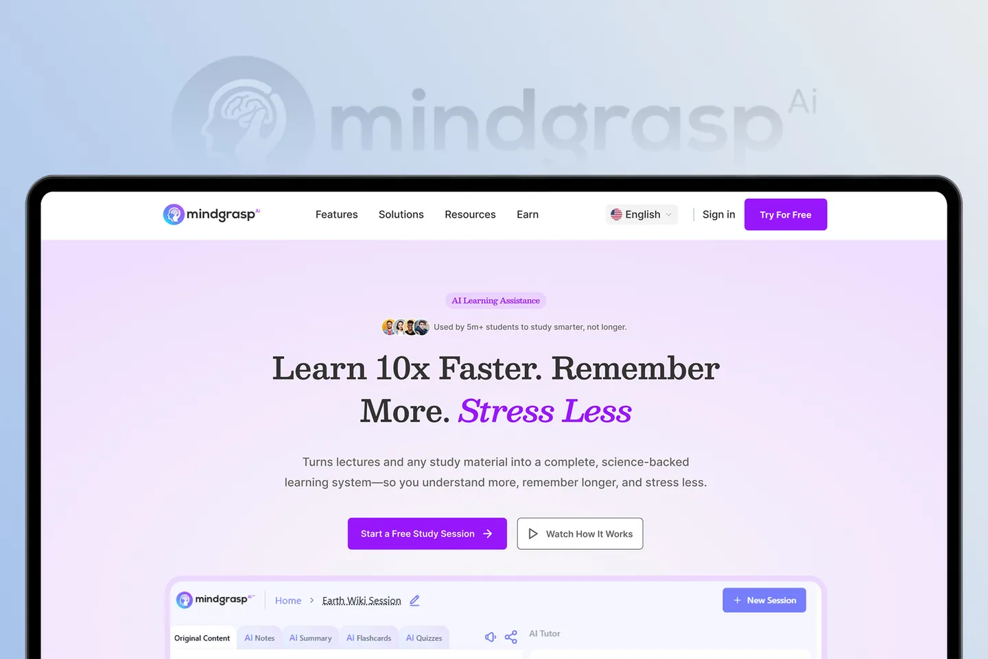
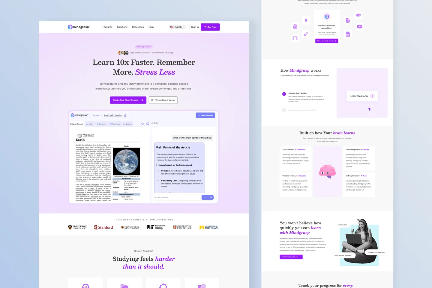
We led with one line — Learn 10× faster, remember more, stress less — and one button. Everything else on the page supports that promise instead of competing with it.
Show, don't list
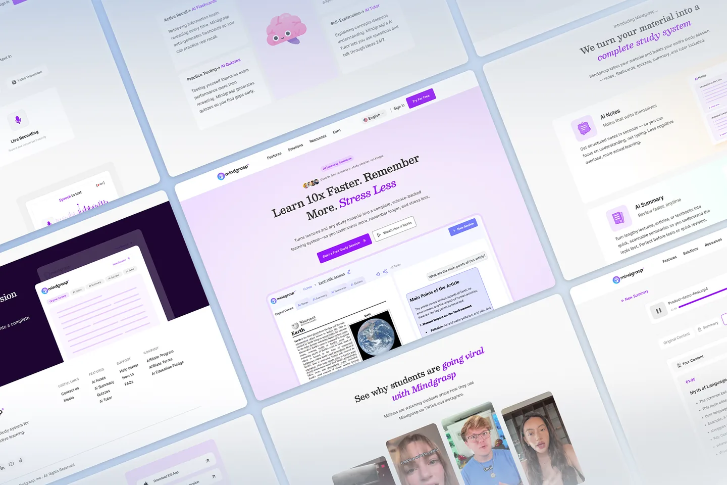
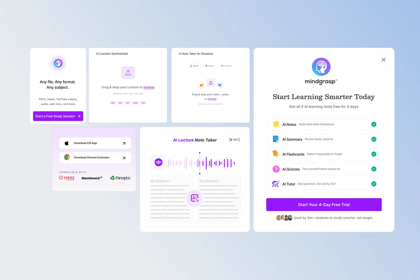
Rather than feature bullets, the page shows the actual study session: original content on the left, AI notes, summary, flashcards and quizzes as tabs. Visitors see the product before they sign up.
Flattened navigation
Features, Solutions, Resources and Earn replaced a sprawling menu. Each section has a clear job and a clear next step.
Modern, calm UI
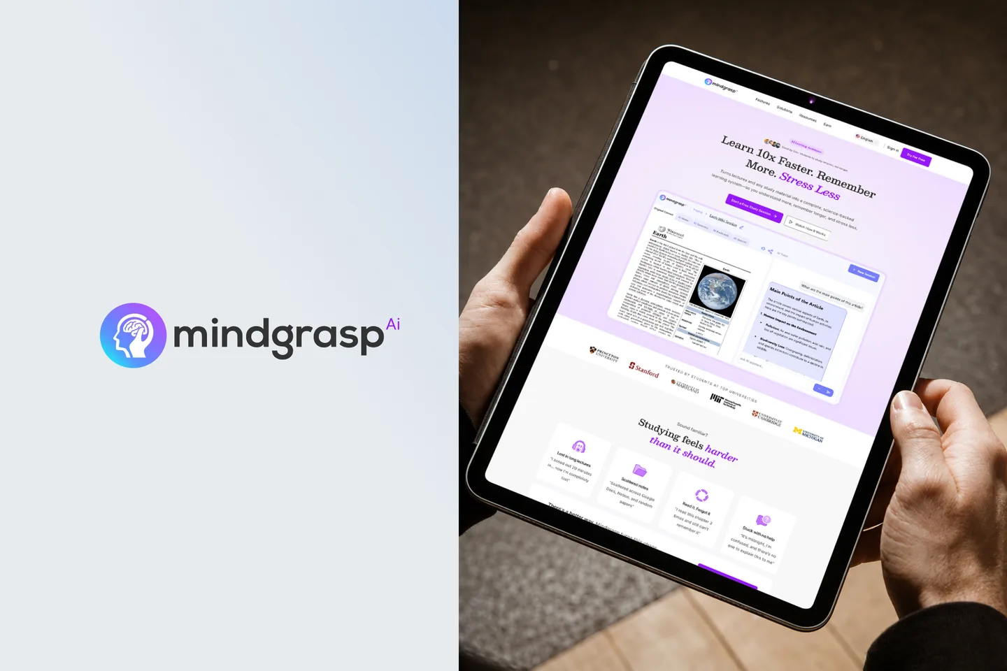
A light lavender palette, generous spacing and a serif display face give the product a focused, academic feel that matches how students want to feel while studying.
Screens and details
Click any image to view it full size.
The outcome
- Overall conversion rate improved 2.9× after the redesign went live.
- Time to first study session dropped as the sign-up path was reduced to one click from the hero.
- The new component library let the Mindgrasp team ship new pages without design debt.