
aitools.xyz
Making a 9,500-tool database feel effortless to browse

About the project
aitools.xyz indexes thousands of AI tools with rankings, traffic data and category statistics. The data was valuable but the interface was cluttered — too many filters, tables and numbers at once. We redesigned it around search and discovery so anyone can find the right tool in seconds.
The challenge
Every page tried to show everything: rankings, trends, categories and raw statistics competed for attention, and first-time visitors didn't know where to look.
Dense tables with inconsistent columns made comparing tools slow, and the most useful data — traffic trends over time — was hidden behind extra clicks.
What we did
Search first
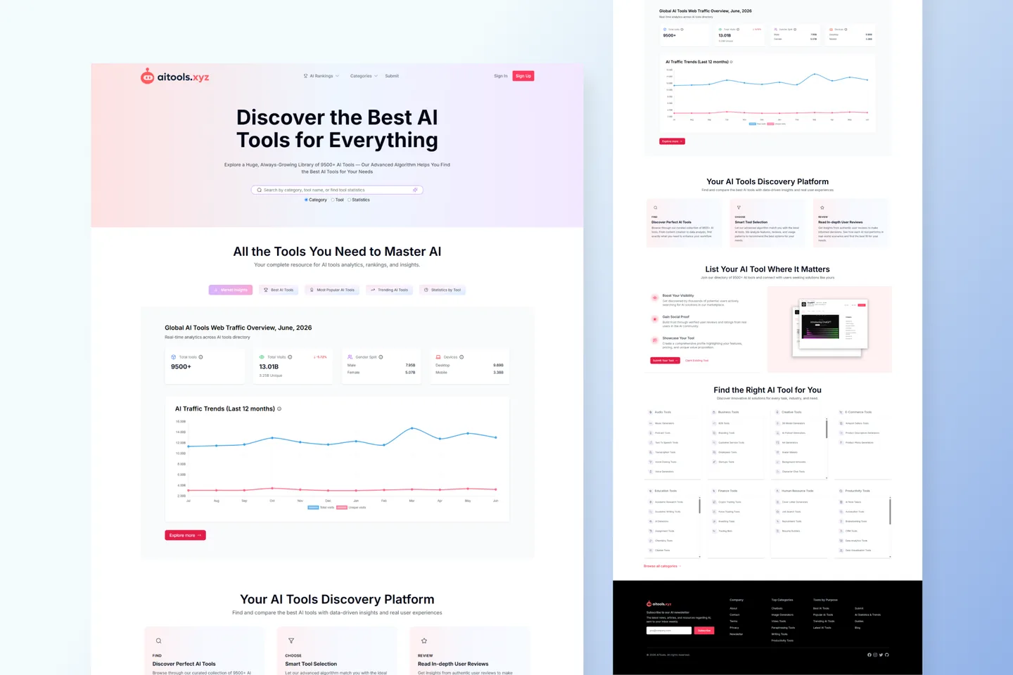
One prominent search bar with three modes — Category, Tool, Statistics — became the front door. The home page answers ‘what are you looking for?’ before showing any data.
Progressive detail
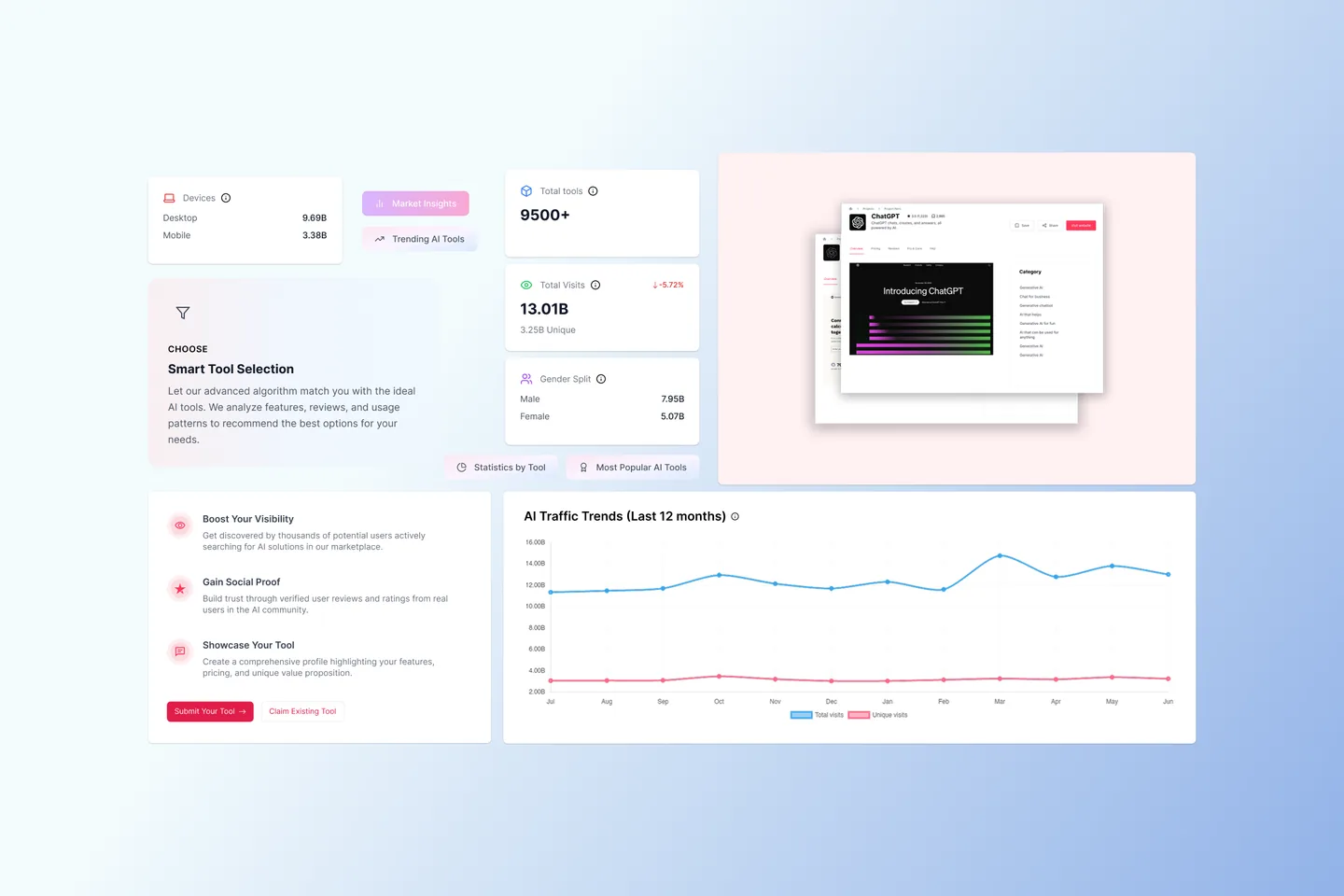
Rankings and trending lists give a quick overview; tool pages reveal traffic charts, adoption statistics and comparisons only when the user asks for them.
One table, many views
A single, consistent data-table component with aligned columns, sparklines and clear sort states replaced the patchwork of tables across the site.
Room to breathe
Soft gradients, clear section headings and a restrained palette turn a data-heavy site into something that feels calm and trustworthy.
Screens and details
Click any image to view it full size.


The outcome
- The cluttered multi-table home was replaced with a search-led experience that surfaces the right tool in one query.
- Traffic and adoption data is now visible on every tool page instead of hidden in a separate statistics area.
- A reusable table and card system means new categories and data sets can be added without redesign.