
ChargeClients
A payments product rebuilt from the website to the dashboard
About the project
ChargeClients lets small businesses create and share payment links for one-time, recurring and open-amount payments. The product worked, but an ageing website and dashboard were costing it sign-ups. Our design and development team is rebuilding the whole experience, and conversion is already up 59%.
The challenge
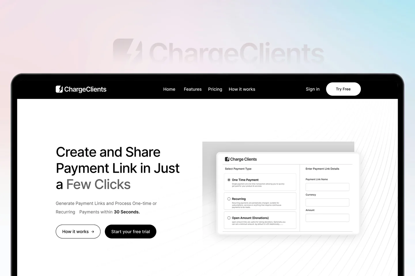
The old website explained the product at length but never showed it. Visitors had to read before they could see how a payment link is made, and many left before reaching the sign-up.
Inside the product, the dashboard had grown feature by feature. Creating a link meant working through forms that didn’t match the website, so the first session felt like a different product from the one that was sold.
What we did
Show the product above the fold
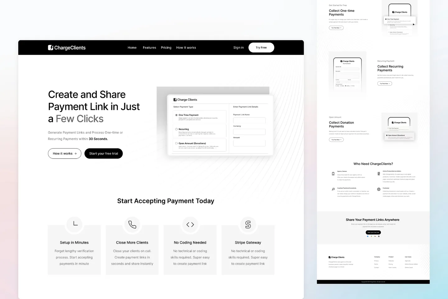
The new homepage leads with one promise — create and share a payment link in a few clicks — and puts the actual link-creation panel beside it, so visitors see the three payment types before they scroll.
One flow for every payment type
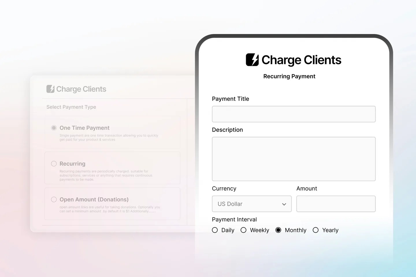
One-time, recurring and open-amount links share a single creation form: pick the type, name the link, set currency and amount. Recurring payments add an interval, nothing else changes.
Website and dashboard on one system
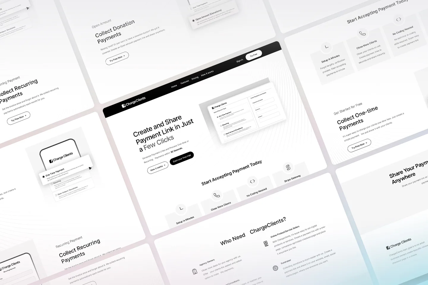
Buttons, inputs, cards and spacing are shared between the marketing site and the signed-in dashboard, so the product people try is the product they were shown.
Designed and built by the same team
Our developers work from the same component library the designers built, which keeps the shipped screens faithful to the designs and lets us iterate on real conversion data.
Screens and details
Click any image to view it full size.
The outcome
- Conversion rate increased by 59% since the redesigned website and dashboard went live.
- Creating a payment link is now one form for every payment type instead of separate flows.
- Website and dashboard share one design system, so new features ship consistently across both.